The sheer volume of data we generate can be overwhelming. Do you ever open a report, scroll through for a few seconds, and think, “Where do I even start?”
I have no doubt that, if you run a small or midsize business, you’ve likely been there. Sales numbers are buried under marketing analytics, operational stats, and a dozen other data points you didn’t even ask for. It’s all “important” information, but somewhere between downloading the report and making a decision, your brain can easily tap out.
This is not unusual. One study found that the average person processes about 74 gigabytes of information every single day, roughly the equivalent of watching 16 movies back-to-back. No wonder it’s hard to focus on what really matters.
So, how do you cut through the noise without ignoring the numbers entirely? The answer, for many SMBs, is surprisingly simple: Visualize it.
This is not an issue your IT service can solve for you, but it can advise you on the tools and set them up for you.
But let’s start at the beginning:
What is data overload?
Data overload is more than just an inconvenience. It is having more information than you can process in a meaningful timeframe. In a small business environment, that can come from all directions, including point-of-sale systems, CRMs, website analytics, social media, accounting software, and industry reports.
The result? You might find yourself:
Being late making decisions because it takes too long to separate the signal from the noise.
Overlooking patterns that could flag a risk or opportunity.
Work duplication as teams separately build their own reports from siloed systems.
Your budget and skillsets play into this, too. Without the resources for a full analytics department or high-end business intelligence software, many SMBs either rely on basic tools or avoid deeper analysis altogether. And even when the tools exist, someone still has to know how to use them.
How can you make confident moves if you can’t see what’s happening in your business clearly?
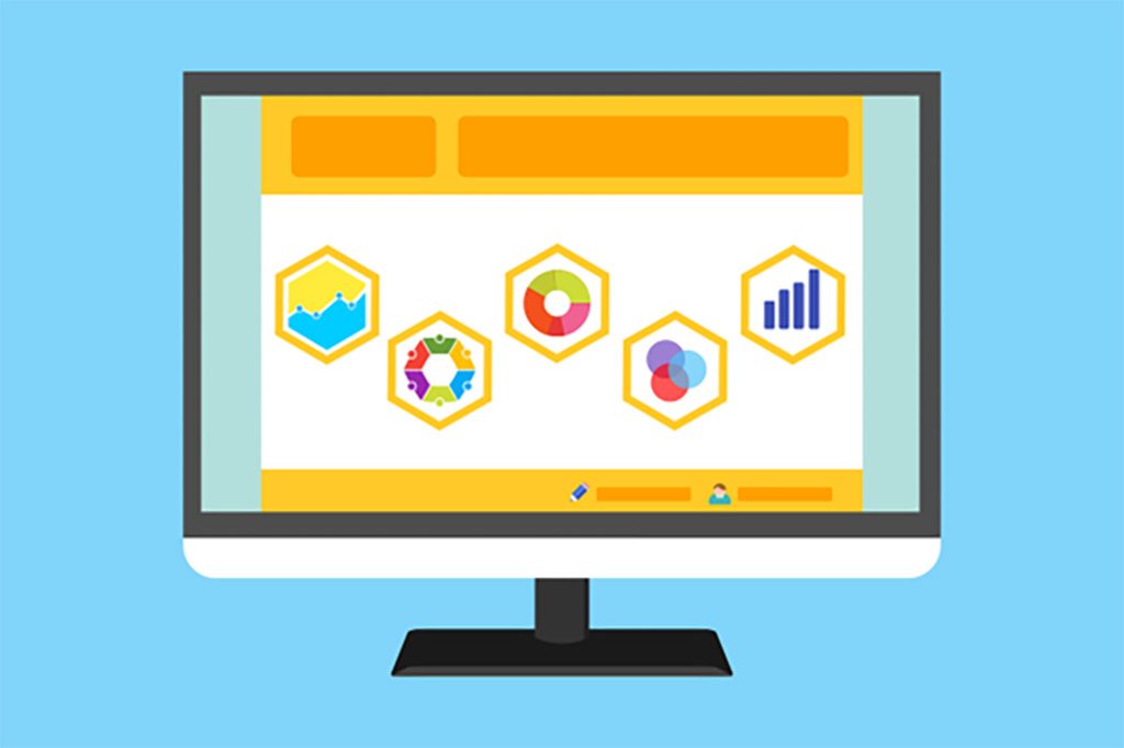
For a Clearer View, Use Data Visualization
This is a way to assemble your data to more easily spot patterns. Data visualization won’t automatically fix messy inputs or bad tracking habits. However, it does offer a way to see your information in a format your brain can process faster. Humans are wired to spot patterns, colors, and shapes far more quickly than they can read through rows of numbers.
Consider a line chart showing sales climbing steadily month after month. In two seconds, the upward arrow shows you the trend. Try getting that instant recognition from a spreadsheet with 300 rows of numbers and transaction data.
Data Visualization empowers Small and Mid-size Businesses (SMBs). Speed matters when you’re running a small business. You don’t have the luxury of week-long deep dives every time you need to make a decision. Visualization helps because:
Patterns emerge: Trends become more obvious: Seasonal swings, sudden drops, or outlier events become visible immediately.
Faster Decision-making: You can focus on the key indicators without wading through irrelevant figures.
Everybody sees the same picture: From your IT services to your front-of-house staff, a clear chart speaks to all.
Improved retention: A picture is worth a thousand words: People remember a visual more than they remember a paragraph of text.
Every worker benefits from visualization. A store manager tracking inventory turnover or a marketing assistant monitoring social engagement find this a time-saving tool.
How to create effective visuals?
A chart that looks like a Jackson Pollock painting isn’t helping anyone. A good visual should feel effortless to read.
Here’s how to make that happen without overcomplicating it:
Remember Your Audience
A marketing intern checking campaign click rates won’t need the same level of detail as a CEO scanning a quarterly update. Think about who’s looking and what they are concerned with.
Keep the Chart and the Story Aligned
Take stock of what visual keeps your story coherent. If you want to compare sales in three regions, a bar chart might do the trick. A line chart would be better for tracking customer churn over 12 months. Pie charts are fine in small doses, as they are best used to understand ‘part of the whole,’ not for direct comparison.
For monitoring website use behavior, heatmaps work wonders. They are also great for analyzing time-of-day activity. They’re great for spotting lunch-hour spikes or late-night orders.
Keep Visuals Lean and Mean
Superfluous, irrelevant data clouds the issue. Strip anything out that doesn’t help someone “get it” faster, like extra gridlines, overdone backgrounds, or five different shades of blue just because the palette was there. Keep your audience focused on what’s important.
Use Color Effectively
Remember that you’re ‘painting a picture,’ not competing with Vincent van Gogh: usually, less is more. One bold hue to flag the key number can do more than a rainbow ever will. Your goal isn’t to impress with design flair; it’s to make the important stuff pop.
Enable Easy Exploration When Possible
It’s not practical to make everything interactive, but establishing an interactive dashboard with filters is like handing someone a magnifying glass. They can zoom in on the exact week, product, or location they care about instead of asking you to dig for it later.
Affordable Data Visualization Tools
You don’t need an enterprise-level budget to create professional, useful visuals. Some of the most accessible options include:
Microsoft Power BI: Strong integration with the Microsoft ecosystem, powerful analytics, and ease of use for business users, often compared directly with Tableau.
Google Data Studio: Free, web-based, and integrates well with popular platforms.
Zoho Analytics: Aimed at SMBs with built-in business intelligence dashboards.
Tableau Public: A great medium for storytelling with data (just remember it’s public-facing).
Excel Power Query and Power Pivot: Perfect for automating repetitive data prep in a familiar environment.
Infogram: Quick, visual-forward infographics and simple reports.
For the best impact, pair these tools with a bit of automation. For example, set up scheduled data imports so you’re not manually pulling numbers each week. Use a basic data-cleaning process to remove duplicates or fix formatting before you visualize. Small steps can make a big difference in how much you trust and act on the data.
Get the Most Out of Your Data
The fact that your business will probably collect more information next year than it does now means that data overload isn’t going anywhere so you have to act to avoid more confusion.
Effectively using visualization turns an intimidating flood of information into something you can scan, understand, and use. Opening your weekly report and immediately spotting the three trends that matter most is a valuable result.
Don’t put off tackling your data chaos because it feels too big: start small. Pick one metric at a time, perhaps monthly recurring revenue or weekly customer footfall, and visualize it cleanly. Build from there. You’ll be surprised how quickly your team starts thinking in terms of patterns and action instead of just numbers.
If you’re tired of staring at spreadsheets and feeling like they’re staring back at you, contact us. We’ll help you strip away the noise, focus on what counts, and make your numbers speak volumes.
Frequently Asked Questions
What are the 5 C's of data visualization?
The 5 C's offer a framework for creating effective, insightful visuals, and the particulars are obvious:
Clarity
Context
Consistency
Correctness/Completeness
Conciseness/Compelling
Can ChatGPT do data visualization?
ChatGPT can create data visualizations, especially with ChatGPT-4 and newer versions. It can generate code (like Python with Matplotlib/Seaborn), interpret uploaded datasets like CSV, Excel, etc., and create charts directly within the interface for initial exploration, analysis, and even basic interactivity.
What is a key characteristic of a good visualization?
You will want your visualizations to be accessible on any device, at any place, any time. Accessible data visualization is one that can be used and modified easily. For user acceptance, the accessibility feature plays a critical role.
What are common visualization mistakes?
Creating confusion rather than clarity is the biggest misstep. Common mistakes like misleading scales, cluttered layouts, and awkward color choices often result in visuals that misrepresent the data or distract from the message.
How secure is your network?
As a reputable member of the IT Support Los Angeles community since 2002, IT Support LA offers a FREE, no-risk network and cybersecurity assessment. It is a non-intrusive scan that allows us to deliver a comprehensive report that is yours to keep. No strings, and no obligation to ever use our Managed IT Services.
The best defenses are expert cybersecurity to protect your data from theft, and a top-notch Managed Services Provider (MSP) to ensure continued reliability and defenses against newly emerging threats.
With our 100% Money Back Guarantee in writing, we offer a risk-free way for prospective clients to try us out. Because we do not require a ‘hard’ contract, our clients can fire us at any time with 30 days’ notice. We have to be good.
Among the Managed IT services we provide:
IT HelpDesk Service
Onsite IT Support
Cybersecurity
Cloud migration and management
Email migration services
Backup and disaster recovery
VoIP phone systems
IT disposition and recycling
Office moves
White label services (IT to IT)
IT Support LA is an award-winning Managed Services Provider (MSP):
o 3 Years awarded Best IT by the Small Business Expo
o Awarded 2nd best company of any type in the US by the Small Business Expo SB100
o Awarded Best IT Support in California by Channel Futures
o Winner of Best IT in Los Angeles by Channel Futures
o Listed as one of the world’s Top 501 MSPs by CRN and in the top 250 in the ‘Pioneer’ listing
o 4 years listed as one of the Top 501 MSPs in the World by Channel Futures
o Listed as #21 MSP in the World in Channel Futures NextGen 101
o Globee 2021 Bronze Award winner for Chief Technology Officer of the Year
o Globee 2022 Gold Award winner for Chief Technology Officer of the Year
o Named one of 2022’s 50 ‘Best’ businesses in California by UpCity
o Named Best of IT winner by UpCity
o Winner of Local Excellence Award for 2021, 2022 and 2023 by UpCity
o Named Best of Cloud Consulting winner by UpCity
o Certified as Top Managed Services Providers and Cybersecurity Pro by UpCity
o Named Best IT in Los Angeles by Expertise.com.
Planning an Office Move?
Contact IT Support LA today! We have the experience to ensure a seamless transition. After the office move, your employees will arrive at the new location to find their IT infrastructure ready and open for business!
For more information on office moves, or to receive your FREE no-risk network and cybersecurity assessment, just fill out the form on this page or call us at:
818-805-0909